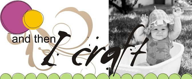
See on this layout how the text overlaps the photo ... yes? Well of course that is easy to do on a digital layout, but a bit more tricky on paper unless you add the text as stickers or die cuts. Because I printed the text on my layout first and then added the photo afterwards, there is no way to overlap the letters ... so this is what I do
I lay my photo in the right place onto the layout and lightly mark in pencil where the photo overlaps the lettering. I then carefully cut around the ovelapping part of the letters and then slip the photo underneath them.
This way I still get that poster graphic look with minimal effort on my part.
I do this with patterned paper too sometimes, like on the leaves on the left side of this layout below.


No comments:
Post a Comment